2019 Color of The Year Is About Our Obsession With Our Phones
According to Pantone, this year's "it" color is "In reaction to the onslaught of digital technology and social media increasingly embedding into daily life," and that this warm hue represents our "seeking authentic and immersive experiences that enable connection and intimacy." In an era where we almost exclusively holler at our crew via text and spend every red light and commercial checking the gram for the latest updates - this color seems to be making its grand entrance at the perfect time. So just as soon as you're done reading this incredibly captivating blog post on your phone, be sure to get outdoors and spend some much quality time with your S.O., kid, or dog.
Pantone goes on to say that Living Coral symbolizes "...our innate need for optimism and joyful pursuits." Preach Pantone! Just like Glen Coco you deserve four candy cane grams for your efforts to distract us from the hot mess headlines on our social apps. Intrigued by 2019's big color trend? If your immediate response was "Yaas!" then here is a little inspiration to get you looking like the on-trend fashion queen you are.
Coral on the Catwalk
Everyone from Fendi to Etro debuted this latest color trend in their spring collections. It came in a variety of tones from tinted peach to saturated red-orange. These variants were married with a mix of deep pigments like forest green to create bold eye-catching garments for the woman looking to drop it like it's hot. There were also feminine demure takes for the basic-but-beautiful crowd. They played on the whimsy of Living Coral by blending it with light and bright shades like seafoam.
Coveted Coral
If this cheerful shade isn't your usual go-to and you're wondering how the heck to rock it, here are a few of my picks for creating a look that's fly AF. Keep in mind that you don't have to go all in like Lady Gaga with a meat dress to make an impact. A simple accent can be just as effective at slaying this color of the year.
1. Relaxed Coat, Top Shop 2. Marisela Hoop Earrings by Baublebar, Nordstrom 3. Cashmere Crewneck Sweater , J Crew 4. Seychelles Plateau City Flats, Anthropologie 5. Giada Bandeau Silk Wrap Watch by Furla, Nordstrom 6. Pantone Color of the Year 2019 Patent Shine 10X Nail Lacquer by Butter London, ULTA 7. Sugar Coral Tinted Lip Treatment Sunscreen SPF, Fresh 8. Oblong Polka Dot Scarf, Gap 9. Beveled Crescent Pendant Necklace, Anthropologie
Complementing Coral
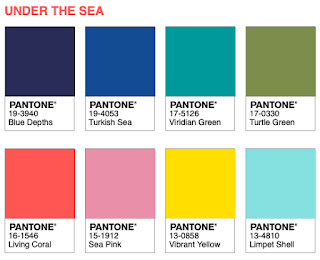
Wondering how to best complement this it color? Don't worry, Pantone got you. Here are three palettes that tickled my fancy. I'm a big fan of contrasting the golden tone of coral with rich and bold hues like teal green or cobalt blue. If you prefer a subtle statement, shoot for subdued shades like mint, light grey, and blush which pair perfectly together like Bey and Jay. If going tonal is your thing, then try blending Living Coral with darker and lighter shades to create an uber chic just-walked-off-the-runway-look.
Peep Pantone's website for even more palettes.
Peep Pantone's website for even more palettes.
Ready to wipe off the oil slick feeling on the surface of 2018 and dive deep into the wondrous world of 2019? Living coral may not solve the issues plaguing our political system or make people less of a Joffrey Baratheon online, but it might put a small spring in your step and make your cheeks look rosier. Shoot, that's good enough for me.


Comments
Post a Comment